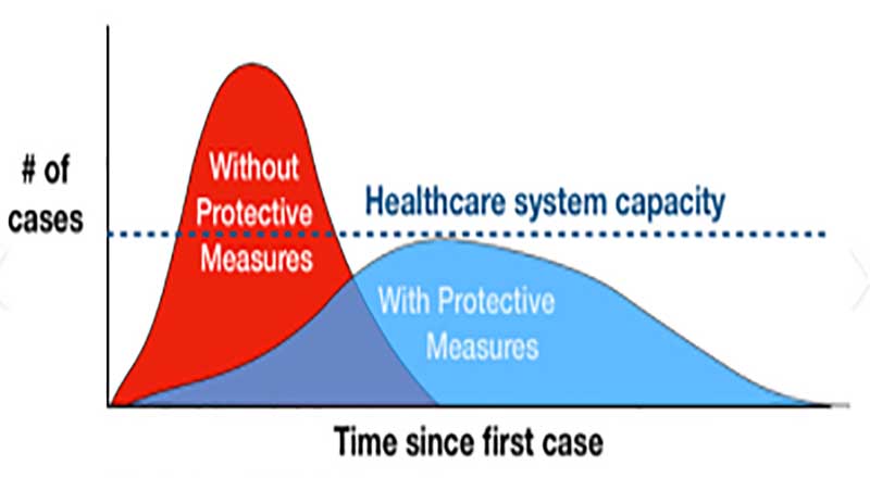
I just googled “coronavirus plateau,” and got more than 13,000,000 hits. With that many hits, it must mean something! It does – this is where a visual presentation of the numbers truly shows what the mind sees when it hears a word. And what happened to “bending the curve” or “flattening the curve”? We’ve all seen images evoking those terms; for example:
Words are barely necessary here. But is this really what the world of COVID-19 looks like? The truth is not such a nice, smooth, symmetrical curve; it’s messier, and very different from country to country. Even so, data visualization still works well.
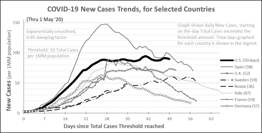
Let’s see how the pandemic has progressed in the six countries that have seen the most cases – U.S., Spain, Italy, U.K., France, and Germany – and throw in Sweden and Russia as well. To even things out, we’ll examine the number of cases per 1MM population in each country. Each country’s graph starts on the day that country reached a threshold of 10 total cases per MM (about 3,300, in the U.S.). We’ll use exponential smoothing, a form of averaging that emphasizes more recent datapoints more strongly. This approach tones down peaks and valleys somewhat, but smooths out the bumpiness and makes trends visually easier to notice.

Four of the countries – Spain, Italy, France and Germany – have curves somewhat like those nice, smooth curves at the top of this article. Spain’s peak is more than double Germany’s. The trend for Italy – which has been dealing with COVID-19 longer than any of the other countries shown – is declining, but more slowly than the other three. And France appears to be showing the fastest decline from its peak – the jaggedness and irregularity of its curve is probably more due to reporting anomalies than any aspect of the disease’s actual progression.
At the same time, neither Sweden nor Russia shows any long-term bend in its curve. While these two countries have seen the slowest upward climb of the eight shown, the rate of new cases in Sweden – which has managed COVID-19 very differently from its northern European neighbors – is only now after eight weeks beginning to show signs of leveling off. And Russia, the newest entrant to this “race,” has shown no deceleration at all after five weeks.
Lastly, the U.S. and U.K. patterns stand out. We can see what the epidemiologists mean by “plateau.” Like the first four countries mentioned above, they reached new cases peaks in 3-4 weeks, but since then their trends have stayed flat, and at this moment, the U.S. is showing the largest number of new cases per capita of the eight countries graphed. The U.S. has a particular challenge, because of its decentralized structure focusing on states for so many aspects of governmental, commercial, and health care management. You could argue that for the purposes of this analysis, we’re really 50 different countries – or 51, with the District of Columbia. The following table, showing a recent 7-day change in total COVID-19 cases in the U.S. overall and in a subjective sample of states, illustrates this point:

Ultimately, the most important question is: Why are all these countries so different from each other? After all, it’s the same virus everywhere – or so we assume. Why have some countries peaked at much higher, or lower, levels? What accounts for how quickly, or slowly, countries reach their peak infection rates, and then decline from those peaks? What accounts for “plateaus” in the rate of new cases? How much of all this is due to the way a country actively manages a pandemic, and how much is just happening, as the pandemic runs its course?
These are questions that epidemiologists and policymakers will be wrestling with and arguing about for years to come.
NOTE TO EDITORS: WHAT FOLLOWS IS ANOTHER VERSION OF THE MAIN GRAPH, IF IT MUST BE PRINTED IN GRAYSCALE.


